Today, I’d like to share with you an exercise in improving our corporate logo. Here it is, in case you’ve forgotten:
![]()
Lovely, isn’t it?
But I started to wonder if something was missing. So, I thought about my deep and abiding respect for the United Kingdom’s second longest reigning monarch, Queen Victoria. What if I added her crest to our logo? Let’s see…
![]()
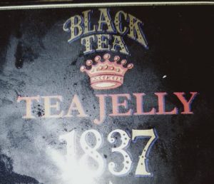
Wow, it’s terrific. But is that everything? No, I’ve got it! Maybe I’ll add the year she commenced her reign.
![]()
I love this, it’s snappy it’s colourful. I think we’ll go with this.. HANG ON WAIT A MINUTE. I’ve just had an AWFUL thought.
What if people thought the “1837” meant we’d been around since 1837? Not everyone is smart enough to realise that it’s merely a heartfelt tribute to our favourite monarch.
In fact, it would be so easy to make that mistake, it might be seen as bordering on deceptive. So maybe we’ll leave the logo as is.
While I’m at it, I’ve always liked this tea logo.
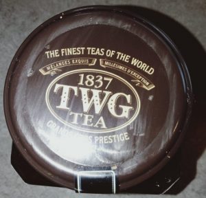
Of course, you will no doubt realise that this tea company, which was founded about a dozen years ago, has only incorporated the number 1837 into their logo, according to their spokespeople, “as a tribute to the year when the Chamber of Commerce was founded in Singapore”. That’s pretty obvious, isn’t it?
I mean if it wasn’t obvious, then a reasonable person might conclude that they are disingenuous, dishonest charlatans.
We are not amused.
Comments
One response to “Charlatans”
I think in English you write something along the year to mean it was founded in, don’t you?
But you are right, no one would.